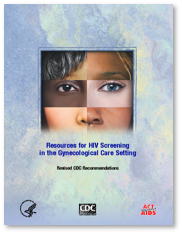
These images illustrate how 2 sister-campaigns were created as spin-offs to the
original brand
look and feel (ie the green version). This approach allowed CRC to keep the
budgetary costs
down while differentiating the design for each target market.
OB-GYN Campaign – Required a feminine color scheme for this specialty market. The art was
stategically
developed to allow Cross River to amortize the original art by eliminating the bottom 2 male facial parts.
developed to allow Cross River to amortize the original art by eliminating the bottom 2 male facial parts.
OB-GYN’s and
Public Health Services
GP’s, FP’s and
Public Health Services
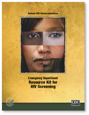
Emergency Rooms
FolderPCP_9042.png)
Routine Testing
3 Sister Campaigns